Calming Down the Grandpa in Office 2013
I got a lot of good feedback on The First Thing to Do to Your New PowerPoint 2013, thanks and wow – happy to help.
So OK, here’s the second thing you should do after you install Office 2013. It’s a bitter post, full of my opinion, and I’m perfectly willing to accept that others may disagree. However, in my opinion this trick corrects one of the most ridiculous mistakes made in Office 2013. You may consider it more of a taste issue. But I think that if you have taste you’ll want your Office interface to not look like somebody’s grandpa sending e-mail with the CAPS LOCK key on.
HEY, YOU KIDS GET OFF MY LAWN!
Yeah, that’s right. For some reason the designers at Office decided that years of calming down the interface, using readability methods developed and proven literally over centuries, should be abandoned so they could inject some “style” into the product. Beware of designers attempting to make their mark.
Application design should fall back against the content, should not stand there screaming HEY LOOK AT ME, or HEY, GET OFF MY LAWN, or HERE’S A JOKE THAT ALL MY SENIOR FRIENDS THOUGHT WAS FUNNY SO I’M ADDING YOU IN MY REPLY-ALL… just for example. UI should be clear, it should be available, but not garish and hard to interpret.
So one of the first things you’ll notice looking at Office 2013 is the ribbon. The ribbon that so many hate, and the rest just find somewhat annoying. Sure it makes it easier for novices to find things, but it’s proven that the ribbon limits experts from levels of productivity they had with the prior menu UI. But we’re kind of stuck with it, and I digress. You see how easy that is.
What we’re looking at most is the tabs. The little label tabs at the top of each ribbon. And they’re all screaming like grandpa.

Hideous, right?
Well, maybe you’re not bothered by it, and hey, good for you. But there’s so much basic knowledge about how typography works, how the eye interprets words and breaks, how recognition is speeded by properly applying basic typographic conventions… all ignored here. It’s tragic really when you consider the scope of Office, how many people deal with this UI on a daily if not hourly (if not constant!) basis. There were lots of people bringing up how ugly and broken this was in the open Beta for Office 2013, but Office designers decided they knew better.
Sigh
Anyway, you can fix this, calm it down. I can show you how. It’s a little tricky, so follow closely.
We’re going to go into the customize ribbon command. Right-click somewhere on the ribbon where there isn’t a button or control, and you’ll see the hidden commands. Choose Customize the ribbon and you’ll see the ribbon customization mess… er… UI.

Now, if you’re pretty perceptive you’ll notice something kinda weird.

We’re looking in the right column, a list of the ribbon titles and the controls each ribbon contains. Funny thing is, all the labels are already in initial cap case. They are not in all-capitals. The UI let’s you change the name of any of these labels, see the Rename button beneath the list, but if you want to continue using the right names you’re kind of stuck.
The developers have special-cased these label titles for each of the individual ribbons so they display in all caps if they match the intended default label. Why did they spend their time doing this instead of fixing bugs or getting good features into the product? Who can tell. We can imagine the passionate arguments the designers put forward about not allowing users to destroy the delicate balance of their screaming grandpa design, but that’s just me recalling similar conversations. Probably nothing like that. But again, digressing.
A little experimenting will show you that the labels
Home displays HOME
HoME displays HoMe
HOME displays HOME
but it’s kind of hard to get it to just display “Home.” But not impossible. Just give it some space.
Or one space to be exact
Select one of the tab labels in the list and click the Rename button. Adding a single space character, either before or after the letters “Home”, apparently is enough of a Jedi Mind Trick that the developer’s force to upper-case code is told “these are not the glyphs you’re looking for” and they pass along to be displayed unharmed. Do this to each label, and you get a nice initial cap label and a much calmer interface.

Yeah, Grandpa is still yelling FILE. If you can figure out a way to get him to calm down there, let me know.
A couple of things
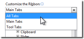
You may want to do all the labels ahead of time. There are more than what are initially shown. Just open the list at the top of the right column and choose All Tabs.
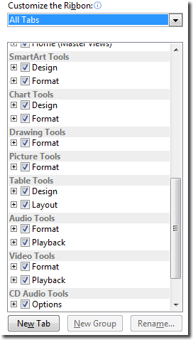
Notice a bunch of items got added to the bottom of the list. These are the “contextual tabs”, tabs that show up when you select certain things, like shapes and tables, to give you control over their options.
It does take a few minutes to change all of these labels, but you’ll find the pattern is pretty easy to get used to. Might take you 15 minutes to add spaces to the end of each label. I think that’s the easier technique to use.
And don’t worry about making a mistake. If you do, you can nuke all your changes and reset the UI to the defaults again. That’s what the Reset button at the bottom is for. You can reset all, or just the selected tab.
And One Last Thing
Which leads us to the last tip here. It’s Extra Credit, so feel free to skip it.
If you’re a writer or instructor or someone who needs, occasionally, to make your UI look like it’s fresh out of the box, you can use the Import/Export UI changes command. It’s just beneath the Reset button.

This lets you save a file with all the customizations you’ve made as a file that you can reload later, even share between machines. So if you need to undo your changes and go back to the just out of the shrink-wrap smell, save your customizations, then Reset everything.
Later when you want to stop grandpa from screaming, just Import the saved settings again and you’re back to a calm, mature looking UI.
Let me know how this works for you.
This somewhat silly article is dedicated to my dear departed father, a grandfather and computer user himself, who eventually learned to just use all lower-case in writing his e-mail.
-Ric
Fun Fact: Did you know that the first few versions of the
Apple computer did not have the ability to display
lower-case letters? The keyboards had a shift key, but
it was used almost exclusively for shifting number keys
to access punctuation characters. The Atari and Commodore
Computers were among the first personal computers to
introduce lower-case letters as a standard personal
computer feature!

[…] Source: https://ricbret.wordpress.com/2013/01/19/calmingdowngrandpaoffice2013/ […]
Stop Office 2013 Shouting – Customization File Downloads » DKitsch.com
February 15, 2013 at 4:11 pm
As far as I’m concerned, the 2007 interface was awful, but the 2010 version made up for all the ugliness, if not for the broken productivity. But they have to keep changing things, don’t they, and in ways that are known and documented (sometimes in other Microsoft resources) to violate best practices.
I wish we could make the active tab show up more clearly. In Excel, the change from dark gray to dark green is hard to see. If you’re going to insist that everything be stark white, at least bold the font.
Hmmm, I wonder if ALL CAPS was intended to highlight just the selected tab, then they got carried away.
Jon Peltier
February 25, 2013 at 7:46 pm
I bet the ALL CAPS thing has to do with the uneficient METRO design style that microsoft has widely adopted. They are sacrificing efficiency and usability in favor of design.
Nacho
February 28, 2013 at 9:42 am
Thanks for THIS COOL TRICK. I hate interfaces shouting at me 😉
Peter
November 20, 2013 at 6:55 pm
Thank you so much… that was so obnoxious and poorly-designed, and you saved me from having a fit every time I open it up.
Angie Marie
December 19, 2013 at 7:12 pm
Thanks for letting me know it helped! That gives me drive to write more similar articles!
Cheers,
-Ric
ricbret
December 19, 2013 at 9:23 pm
I actually assumed that something had gone haywire in my Office installation, possibly due to an anti-piracy feature affecting legitimate installs. But no, it appears MS intended to make every MS Word look like a pirated beta version.
Thanks for the fix, Ric.
Nick
December 24, 2013 at 2:07 pm
Fun Fact: Quite a few “Personal Computers” existed before Apple, Atari and Commodore.
Another Fun Fact: Many (if not most) had Upper AND Lower case letters on their keyboards.
John Whitten
February 21, 2014 at 3:05 pm
Thanks for the note.
Yes, but mostly as kits or bought from other hardware hackers, none of them generally available. Yeah, the Kenbak-1 qualifies, but I think the label Personal Computer was applied retroactively. It was just noteworthy that the Apple II, for all it’s success, didn’t have lc for the first couple of versions.
ricbret
February 21, 2014 at 6:55 pm
I agree that my Altairs were kits. But I got my US Micro (S-100) system fully assembled long before Apple, Atari or Commodore were around. And of course there were plenty of others such as the Cromemco systems, and of course the venerable “IMSAI” of “Wargames” fame. The “SOL”, the Ohio Scientific something-or-other, and a host of others. Those are just ones I remember off the top of my head. Of course, if you went for the KIM-1, a little single-board computer, you had to add your own keyboard, and I suppose you could have chosen an upper-case version if you wanted.
John Whitten
February 21, 2014 at 8:00 pm
Thank you, This will help for sure. I don’t like that everything is thinner font, almost grey on white and smaller print (except for Screaming Grandpa). I’ve been working in MSOffice for more years than I care to admit but the colors and contrasts are difficult to see for us folks of “grandma” age. I miss the top of the screen being a blue bar and everything seems to made to be less obvious/visible. For those of us that produce documents of hundreds and even thousands of pages with a ton of formatting… this is not making me happy. They messed with the scrolling (it appears to scroll then auto-slow)… the same with the typing… At least when Apple messes up they push out an upgrade 😦
Diane S.
March 4, 2014 at 4:51 pm
You’re a good man. Thank you for tackling this daily annoyance.
raj
July 2, 2014 at 9:29 pm
We live in the past here at my employer so I’m one of the first people to get Office 2013 here in 2015. THANK YOU for this! I saw that you could rename, but couldn’t figure out why it didn’t work. The screaming grandpa effect was terribly annoying.
CCC
March 25, 2015 at 3:08 pm
You’re very welcome. Thanks much for the feedback!
ricbret
March 25, 2015 at 3:36 pm
Thanks for this. I wish there was also a way to set an interface color different from white and gray. I have to spend a long time at the computer and I feel my eyes will start bleeding with such brightness! Blue and black looked so nice, and were much healthier.
Nelson
August 13, 2015 at 1:43 am
Colors in the next version are getting a setting that is little darker, but not quite as black as Adobe uses. Still, a major improvement over 2013.
ricbret
August 13, 2015 at 5:51 am